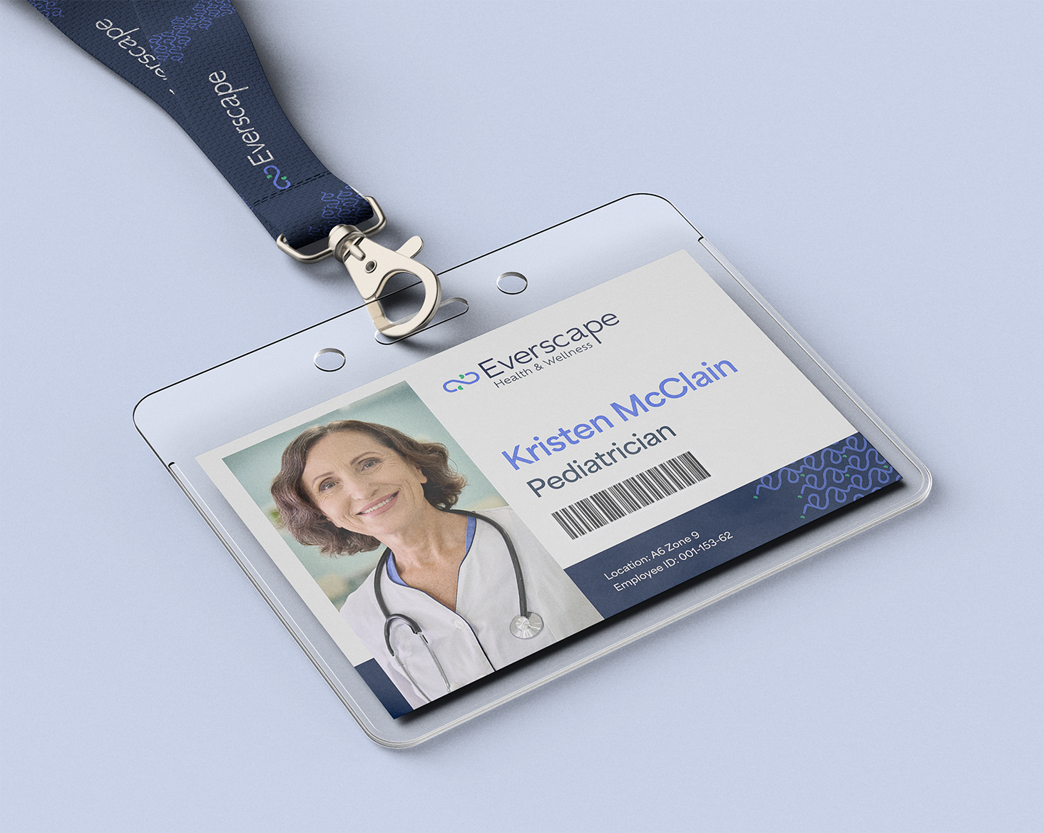
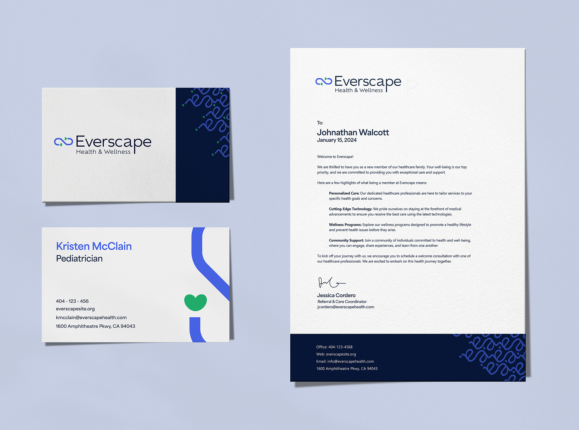
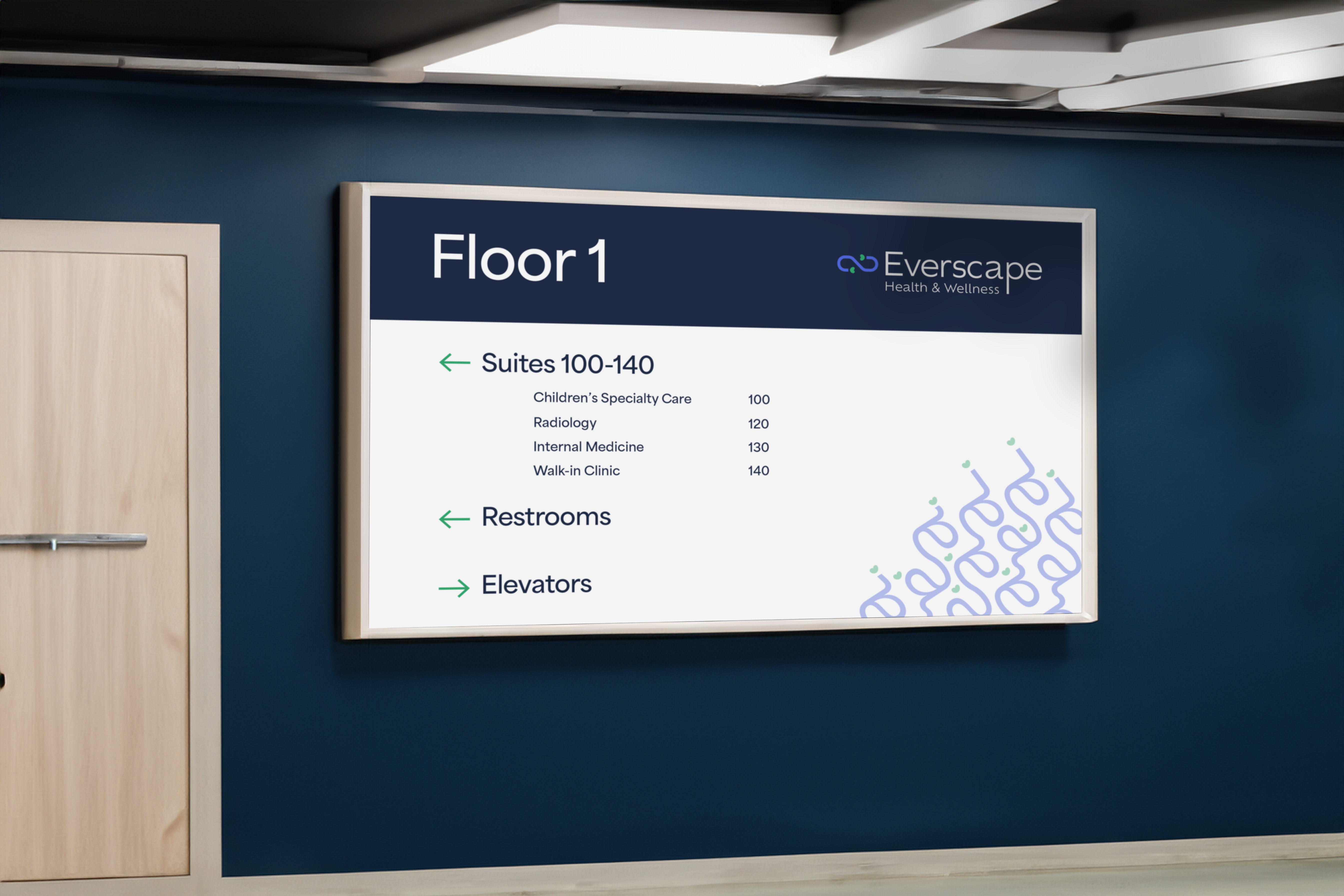
Everscape Health and Wellness
Project Overview:
Branding & Identity, Web Design
Industry:
Healthcare
Concept & Goals:
Everscape redefines healthcare by introducing a holistic approach to medical services. The concept revolves around creating a comprehensive wellness ecosystem where individuals are empowered to thrive physically, mentally, and emotionally. The main goal for the brand identity was to be accessible through visuals and voice.
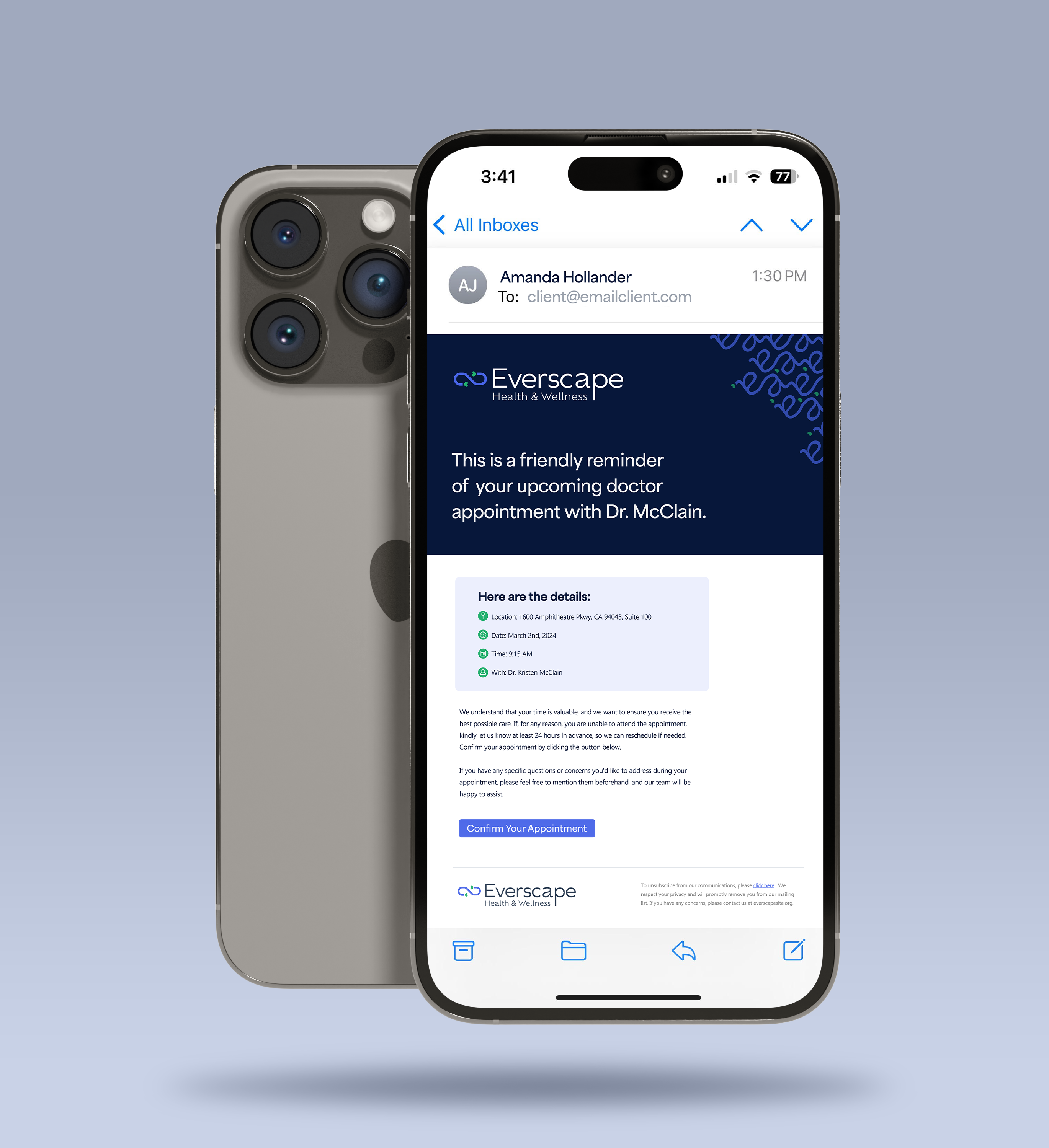
Visual System
The mission of Everscape is to make healthcare accessible for all. With that in mind, it was key the visual identity be easily understandable.
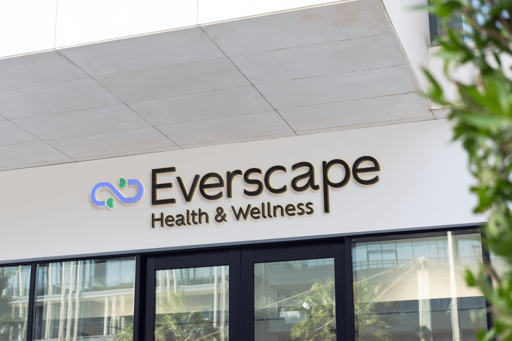
By merging recognizable icons of an infinity sign and a link, the logo symbolizes endless care and strong provider-client connections. Additionally, its fluidity lends to create an organic pattern visual to be used as a secondary element across brand touchpoints.
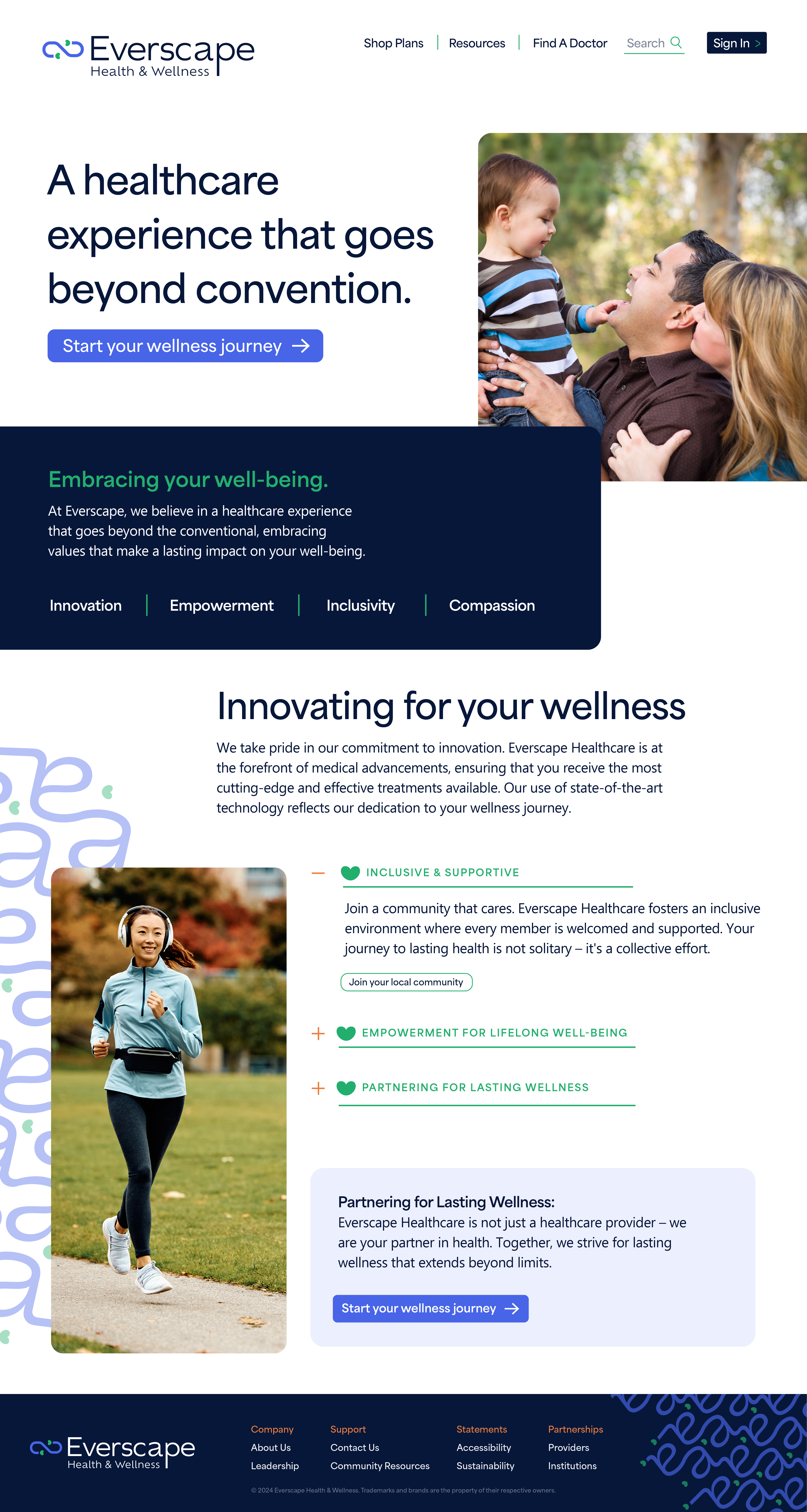
Structured Setup
To uphold the brand’s accessibility standards, typography remains left aligned for ease in readability. A legible font, Area Normal, was chosen for it’s high X-height and geometric build making it easy to read at small scales.
