Equip Finance

Project Overview:
Branding and identity, collateral system
Industry:
Finance
Concept & Goals:
Equip’s mission is to make creating a successful business accessible for everyone, by providing educational resources, business workshops and expert financial guidance to disadvantaged and low-income populations. Establishing a friendly, open and optimistic image and voice were key goals in building the brand.

Illustration and Iconography
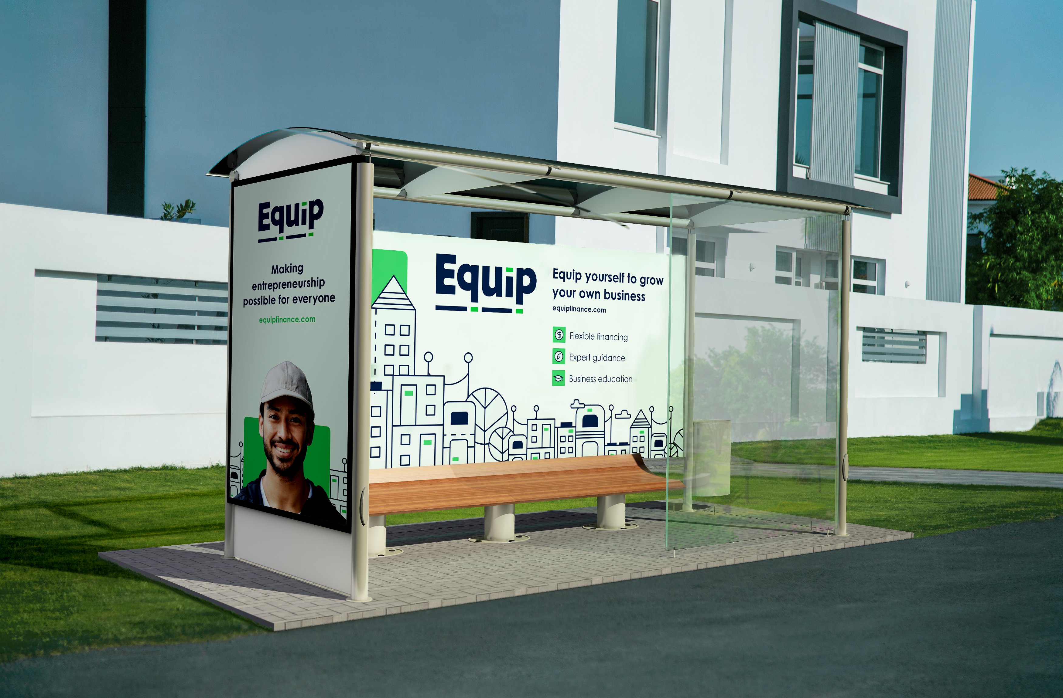
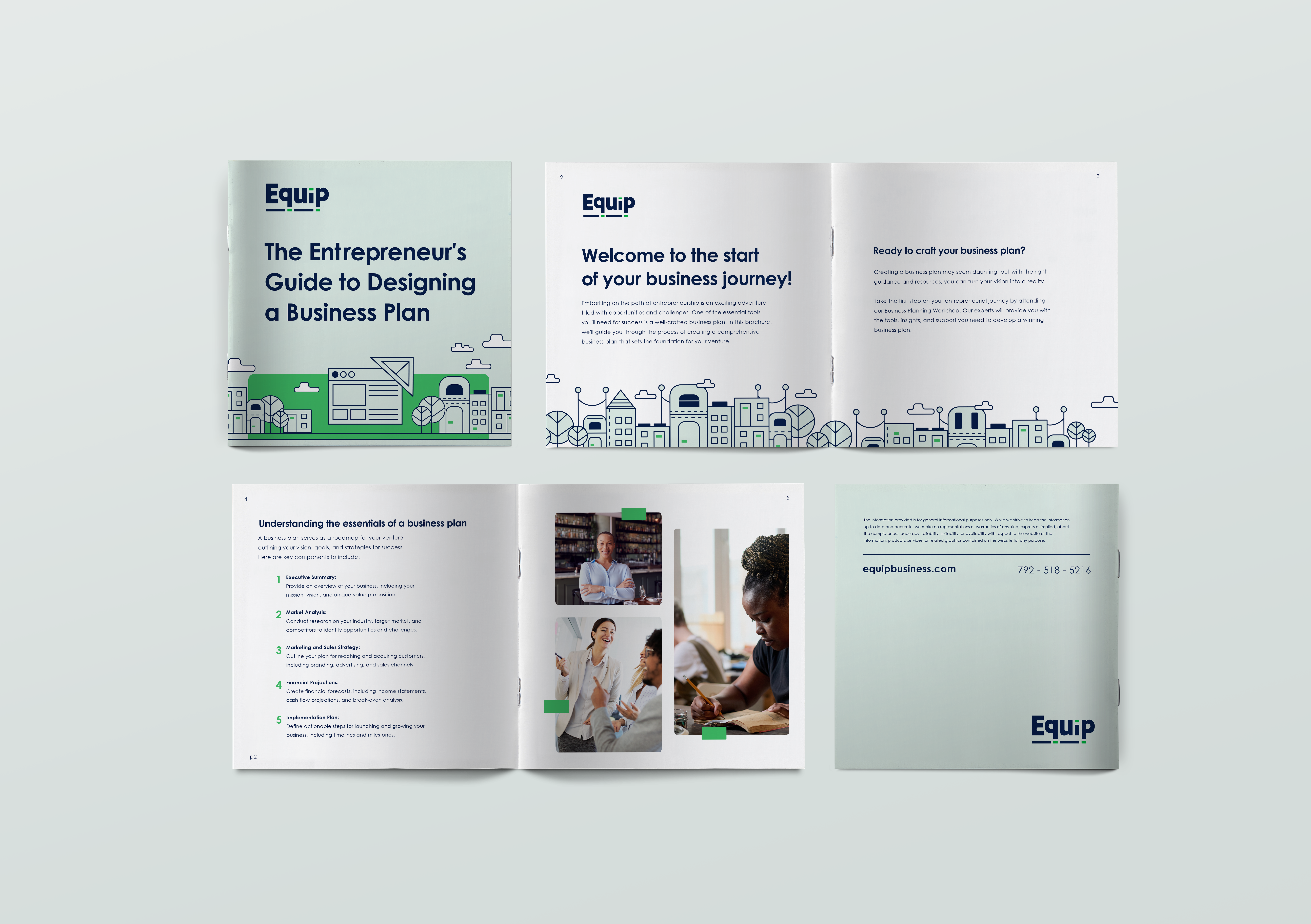
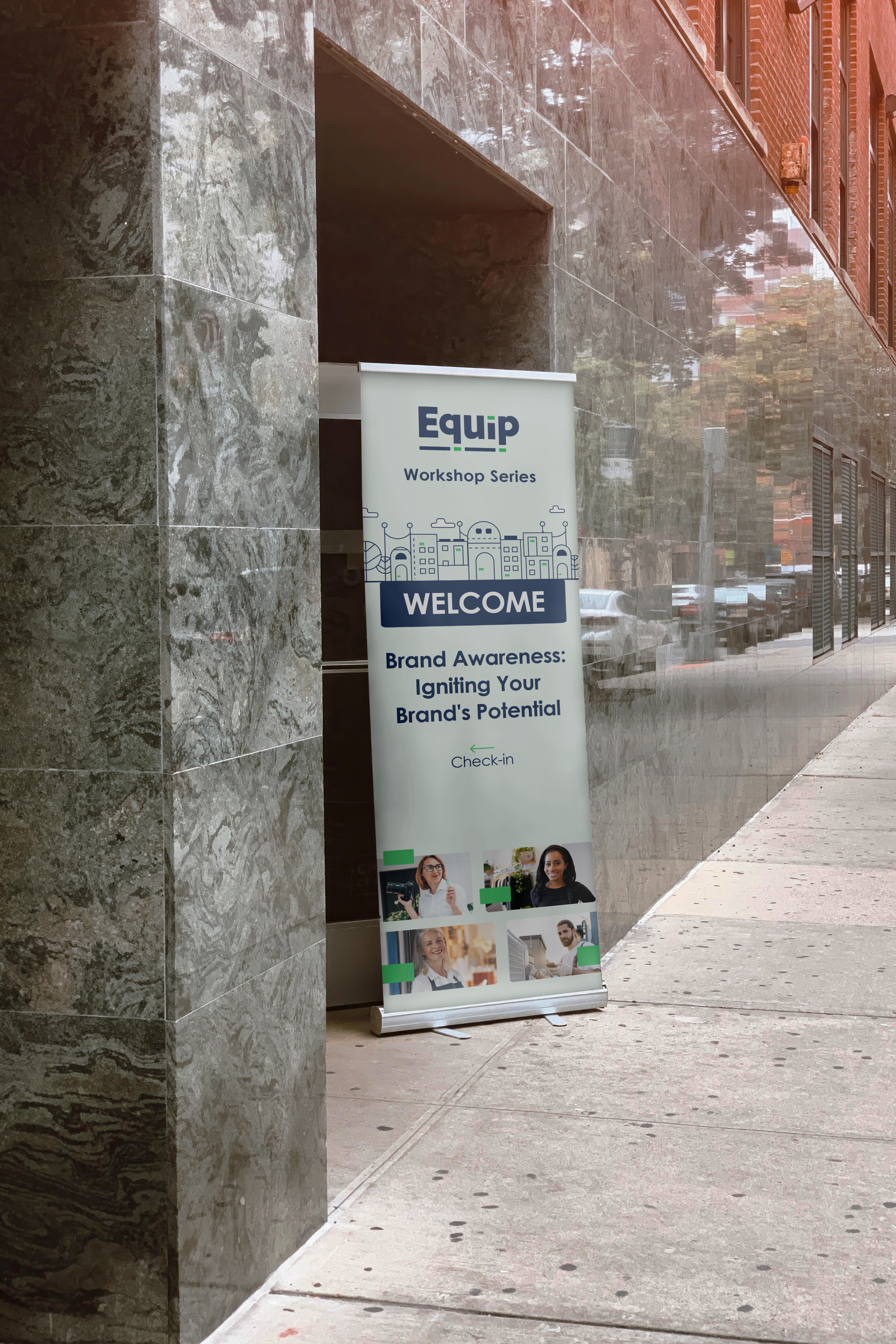
Line illustrations of buildings and cities, accentuated with green highlights, represents Equip’s position in communities supporting business owners. Brand icons match, displaying rounded corners as well as straight edges to mirror the main illustrative visuals of the brand.

Color and Feel
The brand identity is a friendly and approachable reflection of the company mission. With a palette of navy and bright green, the colors signify resilience and opportunity, respectively. A light, muted tint of the main Equip bright green for backgrounds provides a contrast from the standard sterile nature of a plain white in a brand.
The custom logo type features green rectangles evoking dollar bills, symbolizing accessible financial solutions, supported by thick letterforms grounding the green accents.


